Resources /
Blogs
How ClimaChain's historical analysis module turns pollen correlation into territory-level HCP engagement decisions
August 28, 2026
Anshu Singh

For brand directors and territory managers in allergy Rx, the correlation between pollen and demand has always been obvious. Historical analysis is where it becomes operational.
Pharma commercial teams in the allergy category have operated for years with a version of this understanding: when pollen spikes, patients walk in, scripts go up, and field activity should concentrate where the signal is highest.
That logic has been proven correct, time and time again. The feedback I kept hearing from territory managers and commercial excellence leaders, across allergy brands and geographies, was some version of the same thing:
we know the relationship exists, we have seen it play out enough times to believe it, but we have no way to quantify it at the territory level, no way to know which stores or zip codes are most climate-sensitive, and no way to take that knowledge and turn it into a rep deployment decision without adding an entirely separate analytical workstream on top of everything the team is already managing.
And the reason it matters specifically for allergy prescription brand teams is that getting the timing right is crucial in this case. The window between when pollen elevates, when patients cross the threshold of seeking care, and when an HCP is most receptive to a conversation about prescription therapy is compressed. Miss it, and the clinical moment has already passed. Historical analysis gives commercial teams the data infrastructure to stop missing it.
Historical analysis is a structured exploratory analysis module that connects your sales data to climate signals across three sequential views:
The first view, Missed Sales Opportunity, gives you a picture of where actual sales fell short of potential across events over your selected time window. For allergy Rx brands, this view is most useful as a diagnostic context, helping you understand the shape of demand variability across regions.
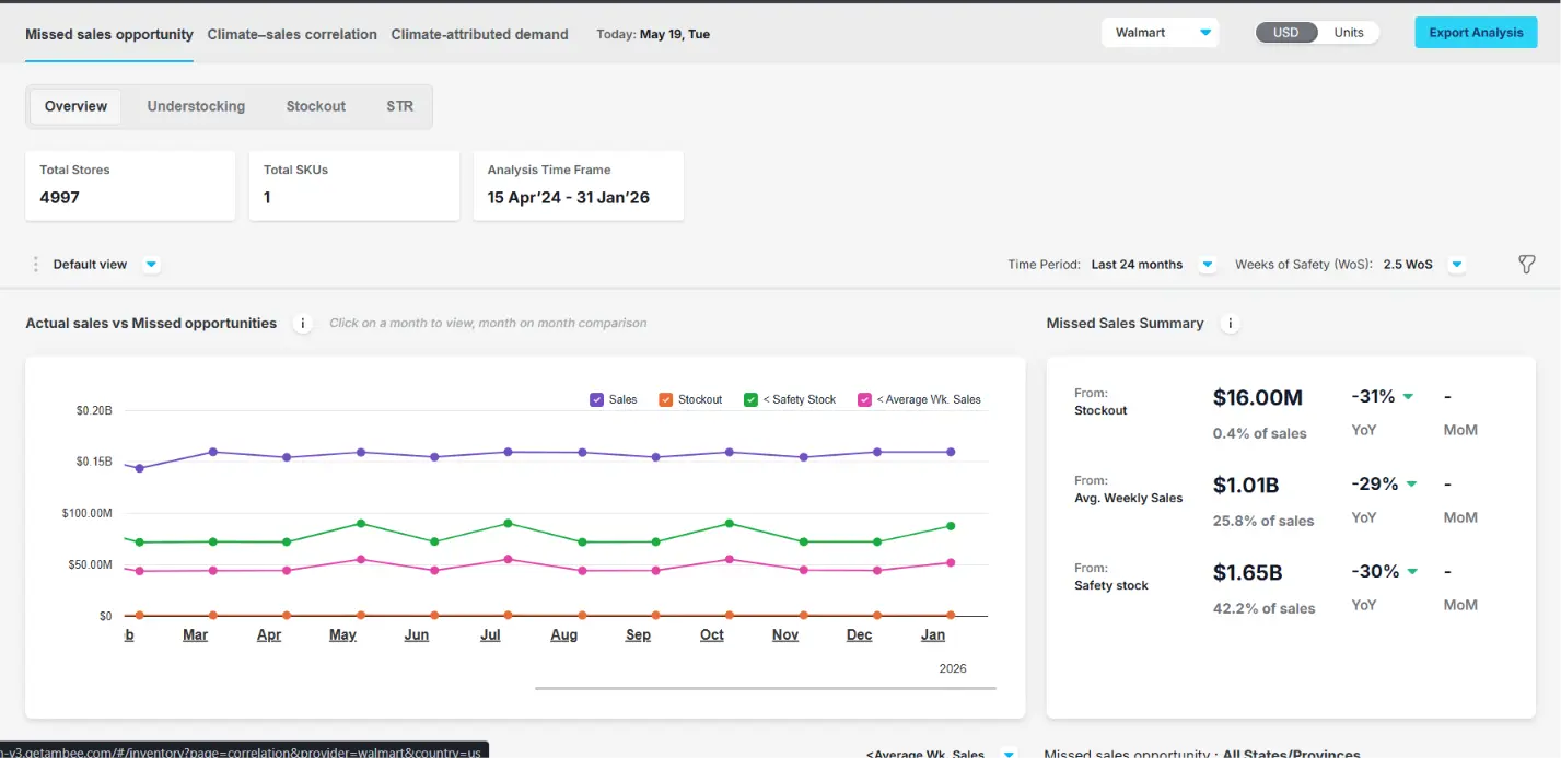
One of the things that came out of building ClimaChain that consistently surprised commercial teams was that pollen exposure does not create a uniform sales response across geographies. The intuition most teams operate with is that high pollen means elevated allergy demand, which is true, but the way that relationship expresses itself at the individual ZIP codes varies significantly, and that variation is where territory-level commercial precision actually is.
The Climate-Sales Correlation view shows you how strongly sales correlate with each pollen type: tree, grass, weed, and total pollen, as well as ILI. It surfaces the top-performing regions by correlation strength, and it gives you a radar view of which climate signal is the dominant driver at the portfolio level.
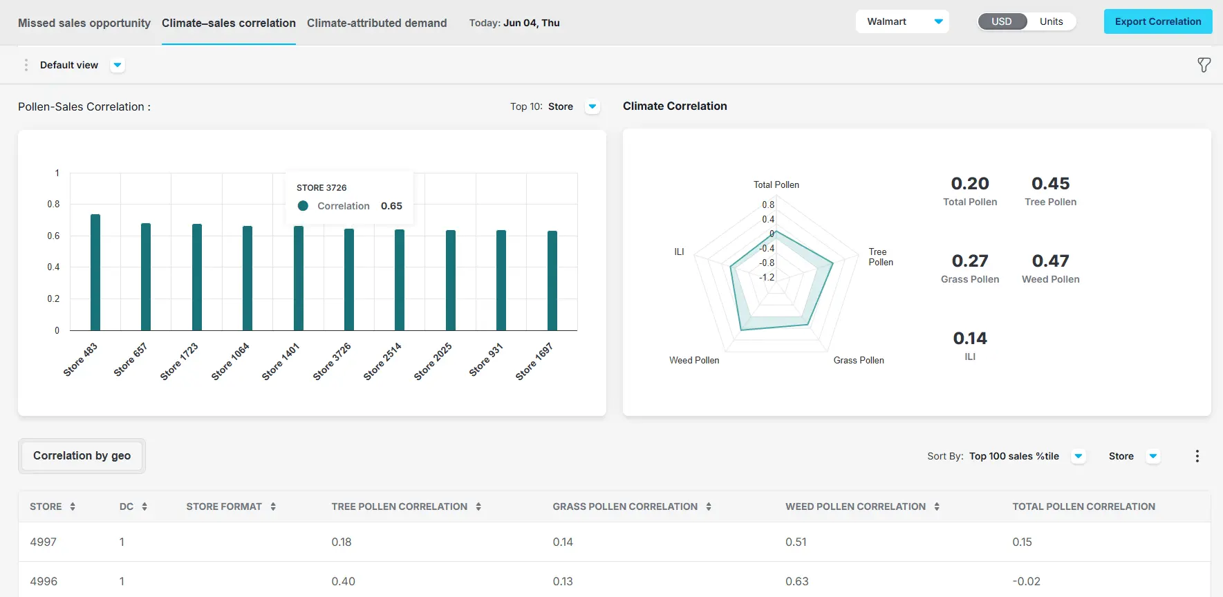
For example, in the image above, weed pollen carries the highest correlation coefficient at 0.47, followed by tree pollen at 0.45 and grass pollen at 0.27. ILI, at 0.14, is the weakest driver in this particular case. The top 10 locations by correlation strength are all clustering between 0.60 and 0.75, which is a meaningful signal that pollen is a real and consistent commercial driver in those locations. The lower correlation in the Correlation by Geo table, with scores closer to 0.15 or even slightly negative, is telling you something different: pollen may not be the primary demand driver in those geographies, and a blanket pollen-driven activation strategy applied uniformly across your network would be both over-allocating in some places and completely missing the right signal in others.
The practical implications are:
A brand director looking at this view can immediately identify which regions have the strongest climate-commercial relationship and concentrate co-op spend and campaign support in those geographies during pollen season.
A territory manager can see which territories are most climate-sensitive and build a tiered call priority that reflects actual commercial sensitivity.
A field rep with this data can walk into a high-correlation clinic during a pollen event and have a conversation grounded in what is actually happening environmentally in that physician's patient population, which is a categorically different conversation from the one built on generic allergy season talking points.
Research published in the International Scholarly Research Notices found that tree pollen concentration peaks drove excess allergy medication sales of nearly 29% above average, with the strongest commercial response appearing at a 2-day lag after the pollen event and a cumulative lift of 141% over the following week. The lag is real, it is measurable, and not the same in every market, which is exactly why territory-level correlation data changes how commercial teams should think about timing.
The third view, Climate-attributed demand, tells you how much revenue that relationship is responsible for. The view separates your total historical performance into two components: baseline demand, which is what would have sold regardless of environmental conditions, and climate-attributed demand, which is the incremental lift that pollen or ILI drove on top of that baseline. It does this at the province or state level, shows you the monthly time series, and gives you a ranked table of geographies by how much of their total demand is climatically driven.
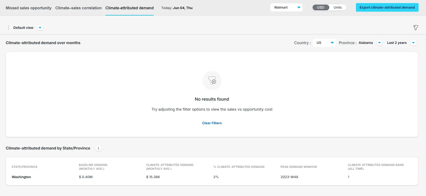
The table in the view gives you columns that matter for commercial planning: Baseline Demand (monthly average), Climate-attributed demand (monthly average), percentage of total demand that is climate-attributed, Peak demand window expressed as an ISO week reference, and a rank that tells you which geographies are most dependent on climate-driven lift. This is the data that makes territory prioritization defensible at the planning table, not just intuitively correct but quantitatively grounded.
For a brand director building a seasonal activation plan, the Climate Attribution % column is the number that changes how you think about where to invest. A territory where 40% of demand is climate-attributed is a territory where your commercial results are meaningfully exposed to pollen timing, and where a field team that is ahead of the spike will consistently outperform a team that is reacting to it. A territory where the percentage is low is not where pollen-driven activation will have the highest return, and knowing that lets you concentrate resources accordingly rather than spreading them flat.
The Peak demand window column connects the historical analysis to forward-looking activation. It tells you, based on the observed history in each geography, when demand is most likely to peak given current pollen forecasts. That is the week your reps need to be in the right ZIP codes, not the week after confirmation arrives in Rx data, which by that point is already describing something that already happened.
A 2023 analysis on the relationship between airborne pollen and allergy medicine sales benchmarked the pollen-to-sales correlation at 71% in a large-scale study across retail channels, which is a strong foundational signal. But 71% at a national aggregate level conceals enormous variation at the territory and ground level, which is exactly what the correlation and attribution views in the Historical analysis module are built to surface and make actionable.
The three-view structure of historical analysis is not arbitrary. Missed sales opportunity shows you the shape and magnitude of demand variability. Climate-sales correlation shows you how much of that variability is climatically driven and where that relationship is strongest. Climate-attributed demand quantifies the revenue at stake and tells you when and where to concentrate field activity to capture it.
The commercial teams that benefit most from this module are not the ones who treat it as an analytics exercise. They are the ones who pull the correlation by geo table at the start of a planning cycle, identify their high-correlation territories, look at the climate attribution % for each, align their peak demand windows with the pollen forecast from climate insights, and hand their field teams a prioritized ZIP codes list before the season opens. That is the workflow historical analysis is designed to support, and it does not require a data science background to run it.
Absolutely not. In simple words, it’s an analytical layer for forward-looking intelligence. Before this kind of analysis was available at the territory level, the best a commercial team could do was apply a national seasonal playbook and hope that the aggregate pattern held locally. Sometimes it did. Often it did not, because the southern half of a territory was entering peak grass pollen season while the northern half was still in tree pollen, and a uniform activation strategy cannot account for that.
Historical analysis changes the input to the planning process. It replaces the seasonal playbook with a signal-specific, timing-specific view of where climate actually drives demand in your network. And it does that not by creating a new analytical requirement for your commercial team but by surfacing the answer in a form that a territory manager can read on a Tuesday and translate into a rep deployment decision by Wednesday.
In a category where the difference between first-mover and latecomer in an HCP engagement is often measured in days, not weeks, that is not a marginal improvement in planning quality. It is the infrastructure for consistently being on the right side of the timing equation.
Book a free demo to see how your specific territories correlate with climate signals and what percentage of your historical demand has been climate-attributed, because once you have those numbers, the seasonal planning conversation looks entirely different.
00:00
/
00:00
00:00
/
00:00
00:00
/
00:00
00:00
/
00:00









.webp)