


Air quality map for any location on the planet
Ambee’s air quality map give you visual representation of hyperlocal air quality data with the highest granularity, to understand pollution behavior.


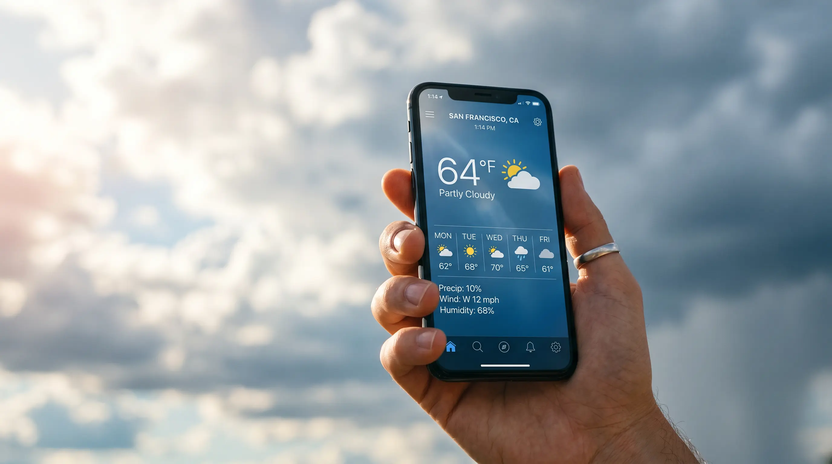
Get real-time and forecast air pollution map at a glance
Air quality map by Ambee are designed keeping in mind easy accessibility to environmental and climate intelligence. The proprietary algorithms, along with science-backed techniques, help make the maps accurate, easy to load and integrate with your solution too.

Get Ambee. Take action to protect your loved ones
FEATUREs of Air pollution map
Built to scale for most applications across businesses


.webp)
.webp)
APIs
Globally accepted, USEPA, NAB-compliant data delivered through easy-to-integrate APIs

Air Quality
Understand and predict air pollution trends anywhere in the world.


pollen
Track pollen levels to protect health and optimize allergy-driven decisions.


weather
Access precise weather insights to plan, forecast, and adapt operations.


wildfire
Monitor fire activity and predict risks for safer, smarter responses.

natural disaster
Detect and prepare for storms, floods, and extreme events in real time.

Influenza-like Illness
Anticipate flu trends and improve population health outcomes.


what you can do with air quality map
Environmental data to add clarity to business decisions
Data visualization
Instantly visualize the criteria pollutant levels with air quality map
Forecast planning
Plan your operations according to the air quality forecast
Behavior analyses
Show your customers pattern of air quality with air quality map
Boost efficiency
Implement high-efficiency tasks with air quality map


BLOGS
Get insights

Frequently asked questions
What is an air quality map?
An air quality map or an AQI map is a graphical representation of the current and forecasted air quality conditions in a specific area. It is typically based on measurements of pollutants in the air, such as particulate matter, ozone, and nitrogen dioxide.


How is air quality measured?
Air quality is typically measured using air pollution monitors, which measure the concentration of various pollutants in the air. These monitors can be stationary, located at fixed locations, portable, carried by individuals, or mounted on vehicles. At Ambee, we use a multimodal system that combines open-source data, proprietary on-ground sensors, and satellite data. This combined data is then run through proprietary AI algorithms to generate AQI in current location and AQI index map.
How often are air quality maps updated?
Air quality maps are typically updated in real-time or near real-time, using data from air pollution monitors. Some maps may be updated hourly, while others may be updated less frequently.
What do the colors on an air quality map mean?
The colors on an air quality map usually correspond to different levels of air quality, with green representing good air quality and red representing poor air quality. The specific range of colors and the corresponding air quality levels can vary depending on the map.
How can I use an air quality map?
An air quality map can be a useful tool for understanding your current location AQI and for planning activities accordingly. For example, if the air quality is poor, you may want to limit your time outdoors or avoid strenuous activities.