Get the most reliable climate data
Oops! Something went wrong while submitting the form.


Ambee Climate Maps V2.2.2 is a major update delivering clearer environmental data for real decisions. The platform now features AI-powered summaries for disasters and extends pollen forecasting to 48 hours for better public health planning. New infrastructure delivers crucial air quality, temperature, and wildfire data in milliseconds, significantly speeding up emergency response and situational awareness for managers.
{{key-insights}}
Our biggest platform update yet delivers clearer insights, smarter interfaces, and faster performance across the board.
We're excited to announce Ambee Climate Maps V2.2.2, a major update that fundamentally improves how you access and understand environmental data. From tracking air quality for public health to monitoring wildfires for emergency response to planning around pollen levels, this release makes critical environmental information more actionable than ever.
The core focus here is simple: environmental data should tell you what's happening and what it means, instead of just showing numbers on a map. V2.2.2 delivers on that promise with features designed for the real decisions you're making every day.
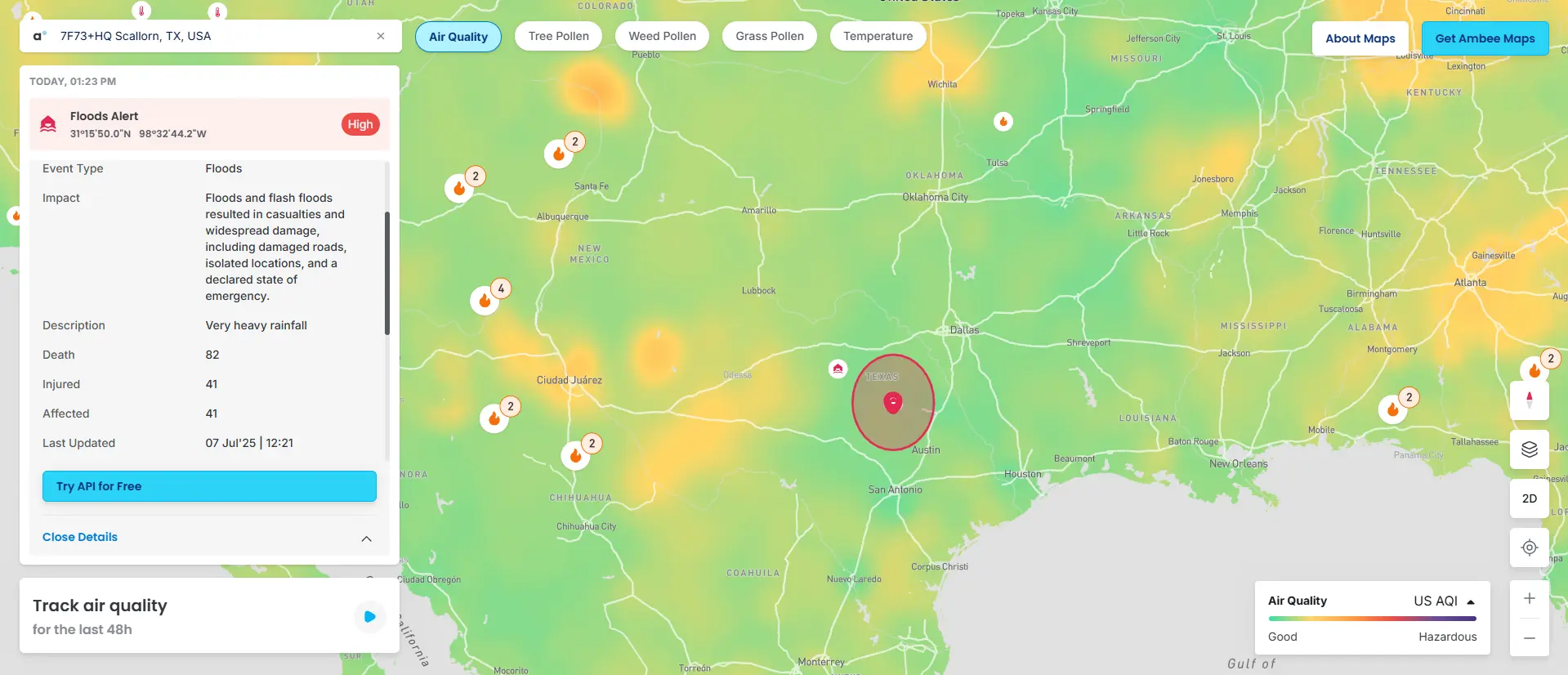
We've moved beyond generic red dots. Each type of natural disaster (earthquakes, cyclones, floods, extreme temperature events, droughts, severe storms, volcanoes, and tsunamis) has its own distinct icon, making pattern recognition immediate and intuitive.
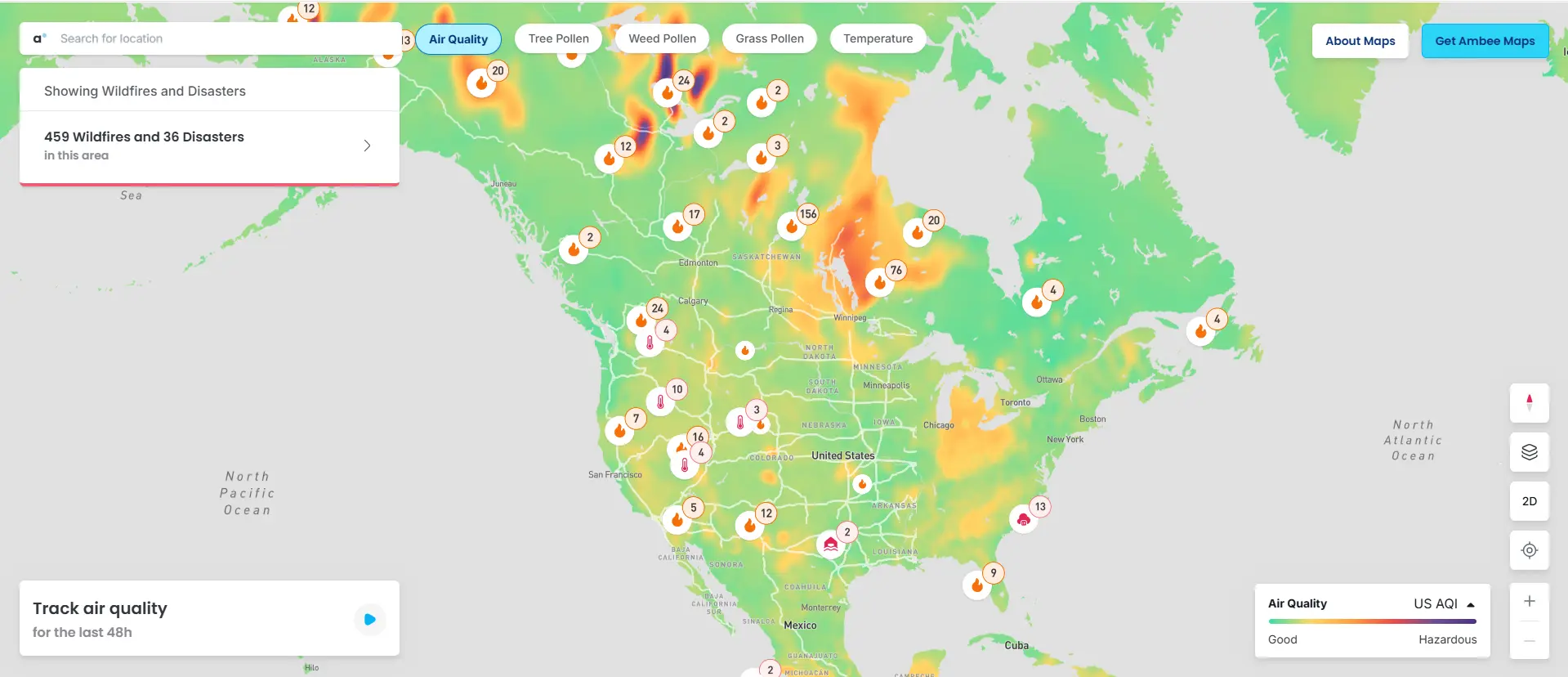
The real improvement lies in our intelligence layer. Click any disaster event and you'll see precise impact polygons plus AI-powered summaries with the details that matter: earthquake magnitude and depth, casualty figures, flood impact zones, and comprehensive damage assessments. Gone are the days of hunting across multiple sources to understand what you're actually looking at.
Wildfire tracking includes burnt-area polygons alongside the metrics emergency managers actually need: affected population counts, injury assessments, Fire Radiant Power (FRP) data, and Fire-Weather Index (FWI) calculations. It's comprehensive situational awareness built for rapid decision-making.
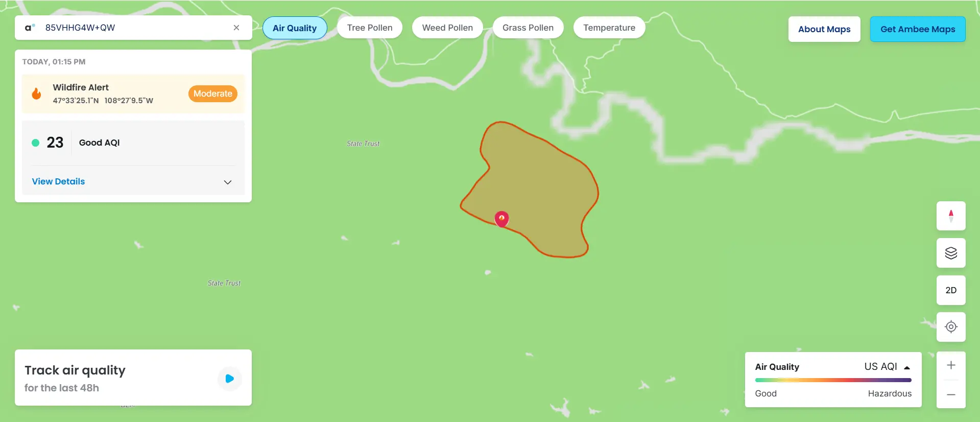
For anyone managing operations in fire-prone areas, this represents a significant upgrade in both data quality and accessibility.
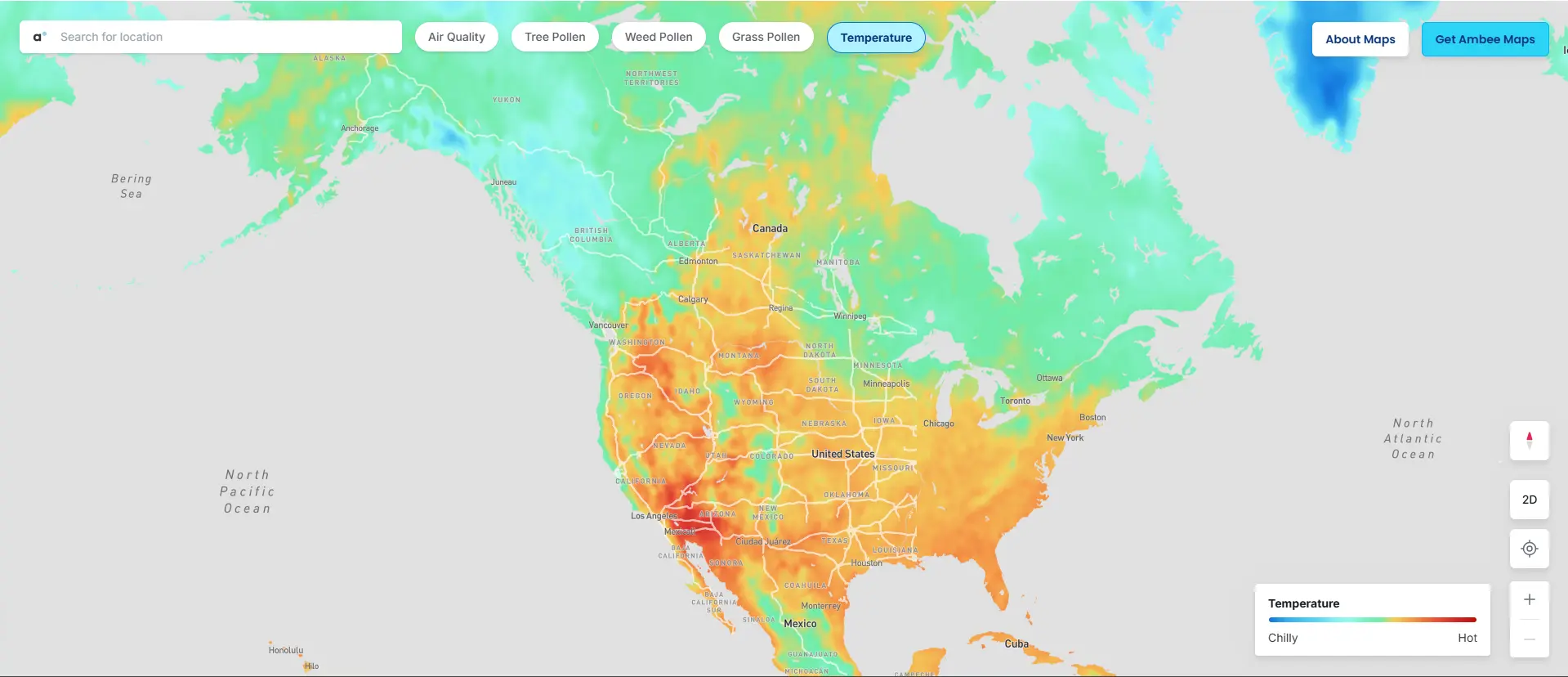
Our new temperature overlay provides hourly heatmaps, but what makes it powerful is the detailed weather cards you get when clicking any location. These show current and apparent temperature, humidity, wind patterns, precipitation intensity, and UV index, plus plain-English summaries like "Warm, clear skies" that translate the data into something immediately useful.
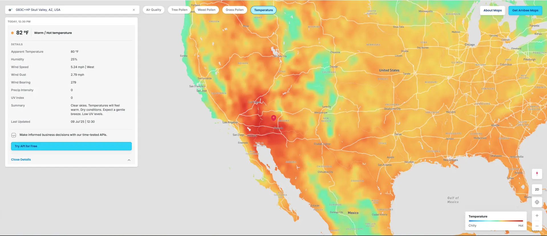
We've also added an official color legend for temperature ranges, so everyone interprets the heatmap colors consistently, from deep blue (cold, -20 to 0°C) through brick red (hot, 30°C+).
Pollen prediction extends to 48 hours for tree, grass, and weed categories. Beyond convenience, this gives families with allergies, event planners, and outdoor facility managers the advance notice they need to make informed decisions.
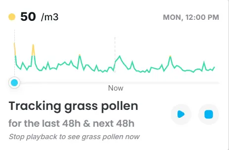
When you're planning a weekend event or managing someone's allergy medications, knowing what Sunday will look like is as important as knowing what Friday looks like.
Everything loads faster. We've rebuilt our tile server infrastructure from the ground up, delivering air quality, pollen, and temperature data in milliseconds rather than seconds. The platform includes smooth mobile rendering and responsive pan-zoom across all devices.
Environmental emergencies don't wait for slow websites. When air quality drops suddenly or temperatures spike into dangerous territory, you need answers immediately.
Environmental conditions increasingly impact everything from daily operations to emergency response. The difference between good environmental monitoring and great environmental monitoring often comes down to speed and clarity: how quickly can you understand what's happening and what it means for your specific situation?
V2.2.2 bridges that gap. Public health officials tracking air quality impacts, emergency managers coordinating wildfire response, and facilities managers planning around weather conditions all benefit from these improvements that deliver the actionable intelligence their work requires.
All V2.2.2 features are live at maps.getambee.com. We encourage you to explore the new capabilities and see how they support your specific monitoring needs.
Need something more tailored to your organization's requirements? We also work with teams to create custom environmental visualizations and integrations. Feel free to write to contact us to see how our platform can be adapted for your specific use cases.


![Best flood data providers in 2026 [Complete list & comparison]](https://cdn.prod.website-files.com/6281f31808e2aa515581d87e/697b512bf5c04ca781af12e9_flood-data-providers.webp)